Empowering the Next Generation: Revamped App Experience Sparks Youth Interest in Finance
In this case study, we will delve into the process of revamping the VI app to GoodWhale to better cater to the needs and preferences of the youth and young adult audience. By conducting thorough research and gathering feedback, we made collective decisions to prioritize this target group and pivot our app accordingly. This article will explore the branding changes, user experience enhancements, gamification implementation, and the positive outcomes of these efforts.
The Brand
To position GoodWhale as a new product and disassociate it from previous brand entities, we created a fresh branding approach. Considering that young users strongly associate with brands aligned with their beliefs, we placed significant emphasis on brand building. Whales, which symbolize prominent investors in the market, are indicators of potentially strong stocks that influence market movements. Working alongside key decision makers, we have established fundamental principles for our brand.
In order to establish a lively brand suitable for animated mediums, we encountered a certain limitation with our simplified logo, prompting us to explore the creation of a mascot. Despite numerous sketches and iterations, the mascot did not receive favorable response from the team. To expedite our design process and facilitate swift modifications to the mascot, we employed generative AI, which significantly accelerated our workflow.
Engaging the Community
To bring the brand closer to the community, we expanded the mascot’s presence across various platforms and mediums. By creating different expressions and animations, we incorporated the mascot into IG Stories, Discord, Telegram, WhatsApp, Line, and WeChat stickers. This strategy aimed to foster a sense of connection and engagement when interacting with our target audience.
Enhancing User Experience
The team conducted a four-step sketching session to explore potential changes aligned with the needs of our target users. Through this process, we prioritized ideas that we believed would meet the expectations of our potential users. We developed a wireframe prototype that retained the core offering of stock analysis while enhancing the user journey and overall experience.
Onboarding and Homepage
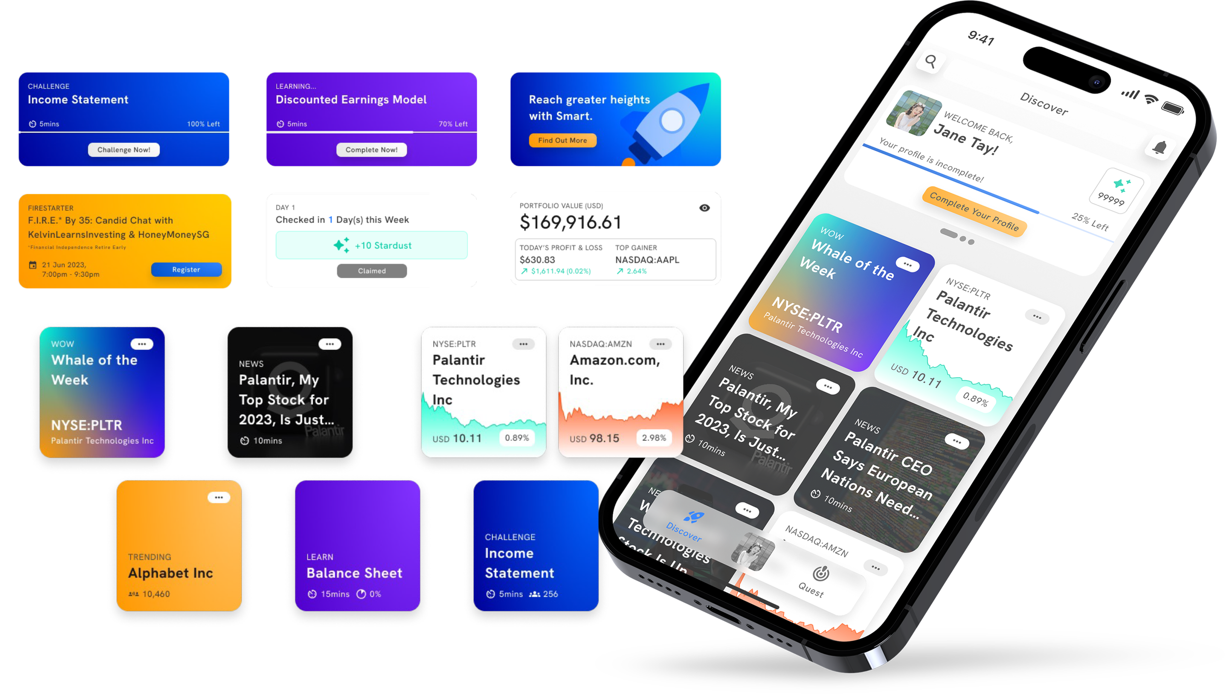
To ensure a seamless onboarding experience, we implemented social login options and collected user interests to provide highly accurate stock suggestions. The homepage underwent a redesign, featuring three key buttons: “profile” for personalization features, “discover” for immediate actions, and an endless scroll experience with stock suggestions based on user interests and behaviors. The “Mission” section of the app was dedicated to the learning and quizzes component, which was a completely new feature introduced to cater to the demands of users seeking knowledge.
Ticker Page
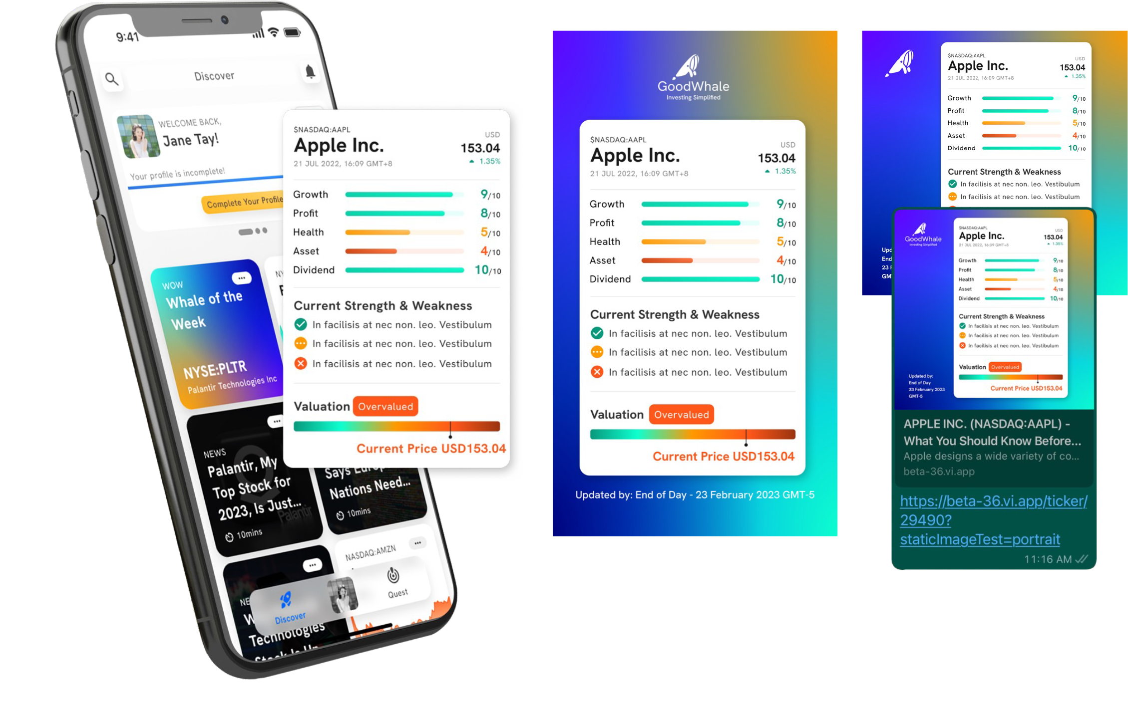
When designing the ticker page, we aimed to fulfill user requirements by incorporating a summary that allows them to grasp the stock’s essence at a glance. Additionally, we explored ways to present the information in an animated and authentic manner, with the intention of automating the process for seamless scalability in the long run. We also introduced a comparison feature to facilitate easy stock comparisons. Additionally, we focused on unifying our content presentation, ensuring that users find our app’s knowledge relatable across different platforms.
Mission and Quizzes
Recognizing that not all users are self-initiated learners, we aimed to make learning easy to digest and engaging. We incorporated duration estimates for each learning module, simplified the content, and designed quizzes with elements of gamification to keep users motivated throughout the learning process.
User Feedback and Concept Testing
To validate our revamp efforts, we conducted concept testing with a group of 16 users, including those who had previously participated in user research and used our app.
“An encouraging 94% of participants expressed their willingness to subscribe to the revamped app.”
We carefully considered the detailed suggestions provided by users, which influenced our development plans.
Shareability
Recognizing the importance of word-of-mouth sharing, we worked on making sharing content easy and worthwhile for users.
Gamification
We also incorporated gamification elements to foster a sense of progression and achievement. By considering business outcomes, player goals, and referencing established game and learning apps, we developed a balanced gamification model. We created a space-themed environment, where users can explore an endless and non-scripted route.
In terms of the in-game elements, we defined star dust and experience points as the in-app currency. To develop our gamification model, we drew inspiration from the Player Engagement Model, Game Economy, and Octalysis Framework.
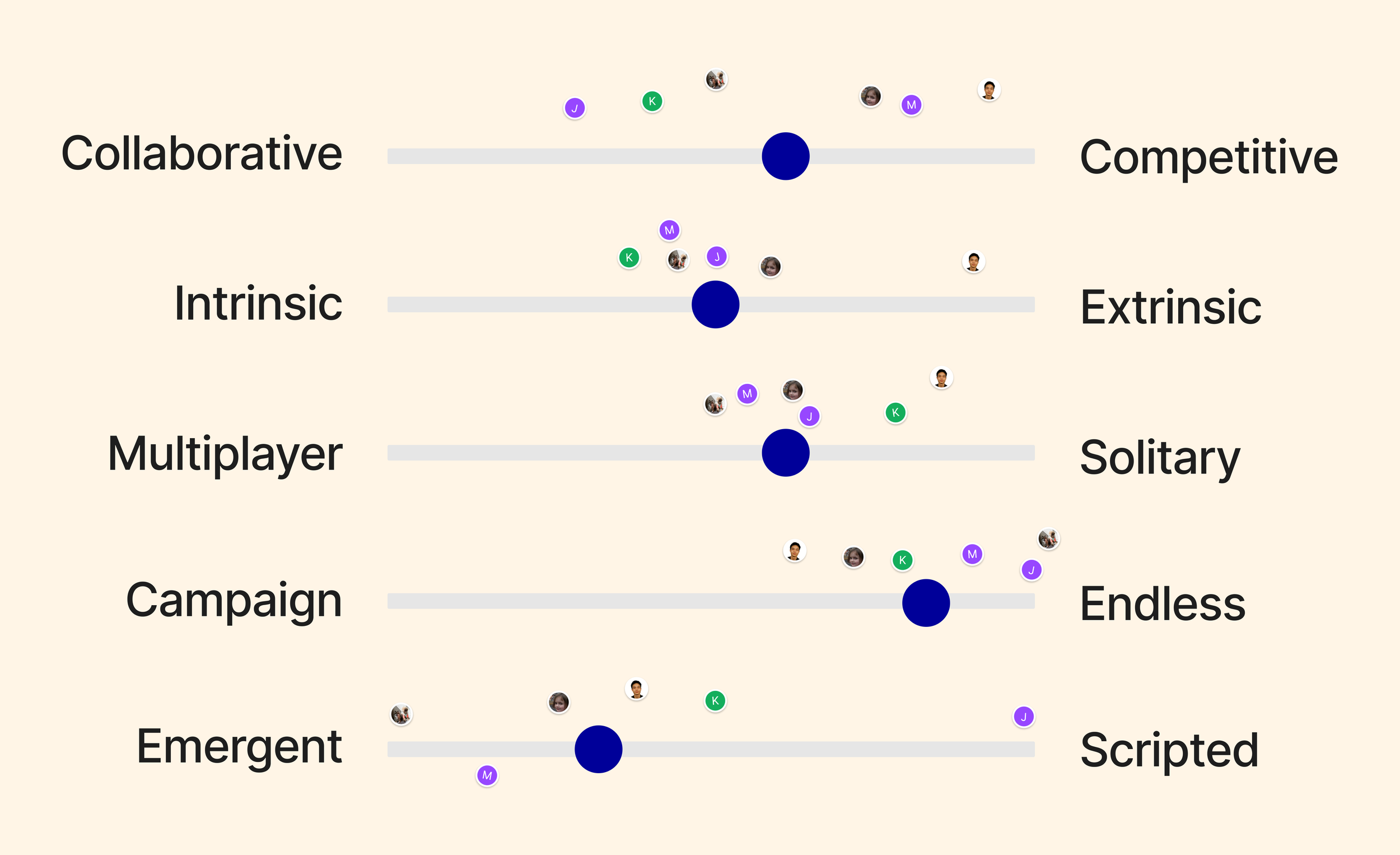
Player Engagement Model
Collaborative | Competitive
The in-app engagement encourages healthy competition while also promoting collaboration through seasonal group-based challenges.Intrinsic | Extrinsic
User motivation within the app is balanced between individual progression and external rewards, such as social recognition or prizes.Multiplayer | Solitary
Although users are encouraged to be part of the community, they can engage independently whenever they’re available or on the go.Campaign | Endless
The app leans towards an endless experience, allowing users to continuously progress and choose what they want to learn. This approach also facilitates scalability and module expansion.Emergent | Scripted
To encourage innovation, the app favors emergent gameplay outcomes, providing room for unexpected and creative game experiences.
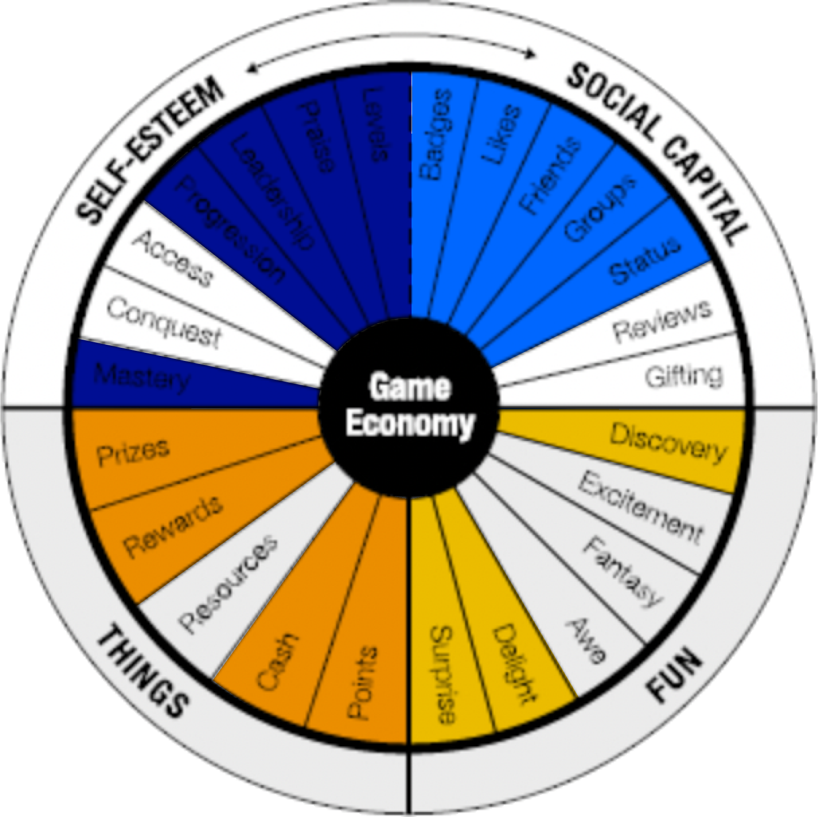
Game Economy
Self-Esteem
Users gain experiences and progress through levels, receive praise through leaderboards, rankings, profiles, and sharing, demonstrate leadership through rankings, and achieve mastery by learning new modules.Social Capital
Badges earned by completing lessons and challenges, likes received for upvoting or saving stocks, forming investment groups and friends within the app, and ranking levels as a measure of social status.Things
Seasonal prizes for challenges, considering rare in-app badges or real-life items, rewards that convert star dust into tangible values, cash rewards converted from star dust, and points as the in-app currency.Fun
Constant discovery of new potential stocks and challenges, as well as the use of gamification ideas and rewards to enhance the overall app experience.
Octalysis Framework
Meaning & Calling:
Users are empowered to acquire knowledge easily at the initial stage, and their engagement contributes to the greater purpose of educating others. The app helps users reach their personal financial goals by providing applied knowledge and confident investment decisions.Development & Accomplishment:
Users’ progress is reflected through ranking systems, leaderboards, the ability to help others, and yearly wrap-ups that allow for recapping and sharing achievements.Empowerment of Creativity & Feedback:
Users are empowered to make investment decisions and receive instant feedback on their challenges. They can also analyze their portfolios based on their selected choices and receive feedback from other users.Ownership & Possession:
Users feel a sense of ownership through their learning journey, displayed levels and rankings, badges earned, portfolios and watchlists with feedback, and the ability to share their content outside the app.Social Influence & Relatedness:
Users’ stock choices, upvotes and downvotes, and external recognition through personal links contribute to their social influence and relatedness.Scarcity & Impatience:
Seasonal and unique rewards, limited challenges, and time-sensitive case studies create a sense of scarcity and motivate users to engage.Unpredictability & Curiosity:
Seasonal rewards, quests, modular learning paths, and mystery rewards maintain users’ curiosity and engagement.Loss & Avoidance:
Users are motivated to maintain daily/weekly streaks and avoid missing out on seasonal rewards, as well as to prevent negative feedback from other users.
Our gamification structure emphasizes positive motivators while taking into account some elements of negative motivators. We have carefully designed and planned this structure to achieve a balanced and engaging experience, with room for testing and iteration as we move forward.
The product has undergone a revamp based on the considerations mentioned above, resulting in the following changes:
Easy Onboarding
To cater to the quick, impatient, and FOMO-driven youth and young adults, the onboarding process has been simplified. Users can sign up easily using their Apple or Google accounts, and the process has been kept short for quick access to the app.
Curiosity-driven Discovery
To feed their curiosity, the app allows users to select their interests, which helps them discover companies they may love. If users don’t make a selection, they are presented with trending companies that align with similar user profiles.
Homepage
The homepage now features versatile widgets to cater to different potential needs. Users can engage in endless scrolling discovery based on their interests, which is guided by an algorithm defined during onboarding. The thumbnails on the homepage serve different purposes, such as highlighting trending stocks, relevant news, updated stock status charts, suggested lessons, and in-app challenges.
Ticker Summary
Users can now quickly understand how a company is currently performing through a ticker summary. Sharing functionality allows users to discuss companies on the go and raise awareness of the app.
Quest
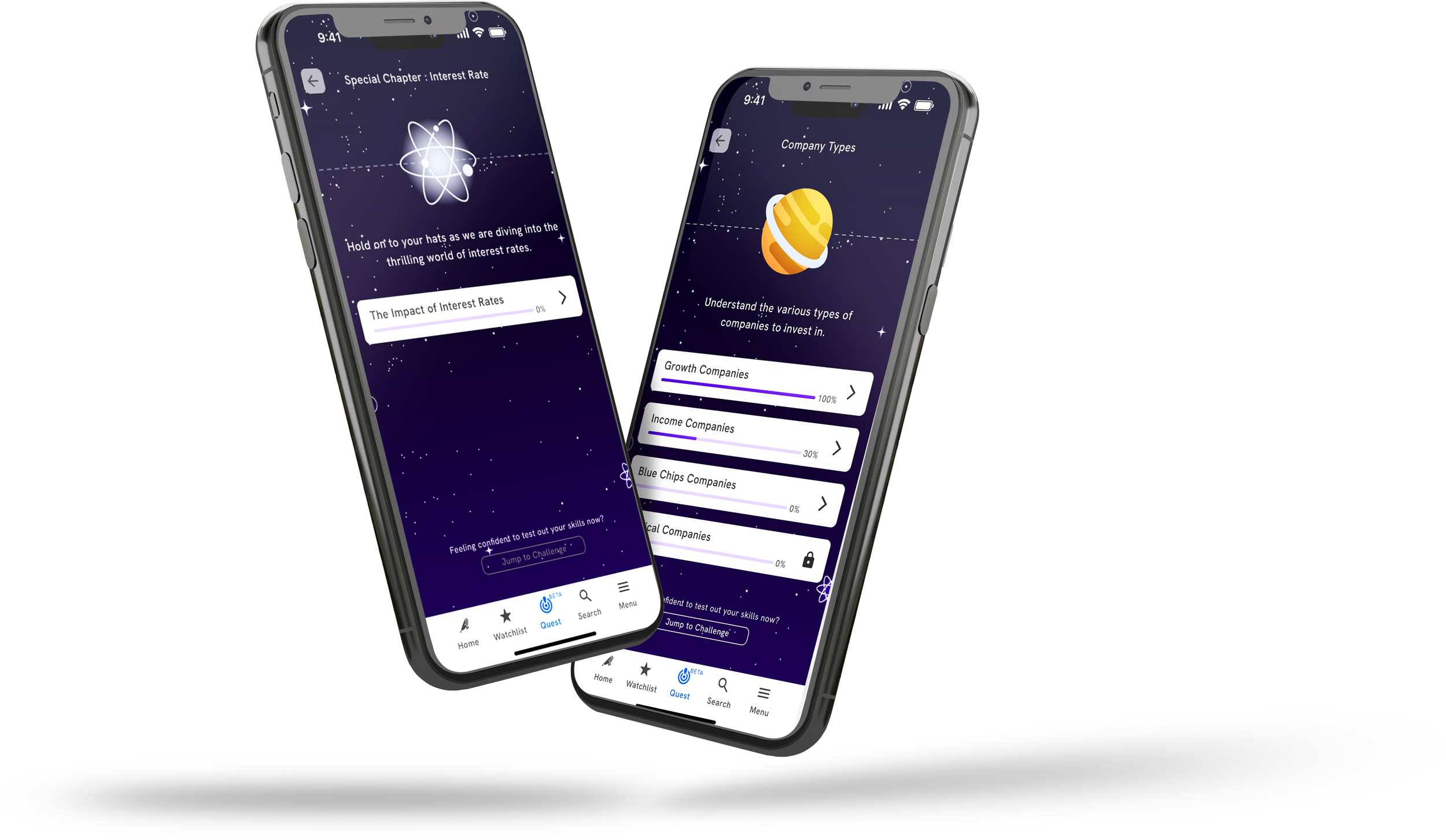
The quest feature creates a learning space zone where each lesson is represented as a planet, and each planet includes 5–7 modules. A distinct purple color scheme is used to communicate learning within the app.
Lesson Modules
Each module includes a progress bar to inform users of their current status. Users can also jump to challenges immediately, as challenges are paired with the overall lesson. Once completed, users can revisit past challenges.
Lessons Flashcard
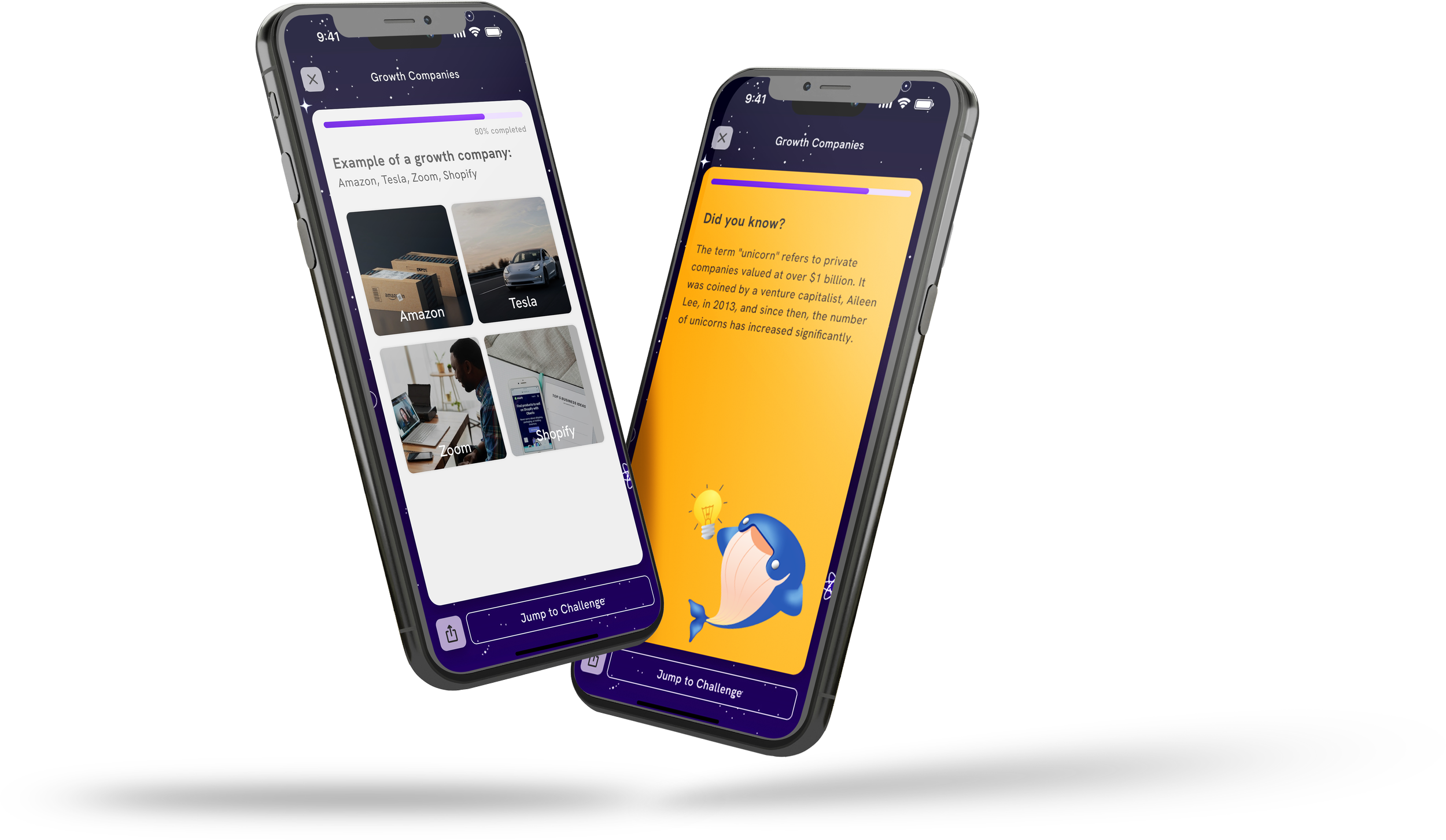
Consistency is maintained with the use of flashcards in lessons. The content is designed to be worth sharing and is kept concise, with each card containing less than 350 characters. “Did you know” fun facts are injected to enhance user engagement.
Quest — Quiz
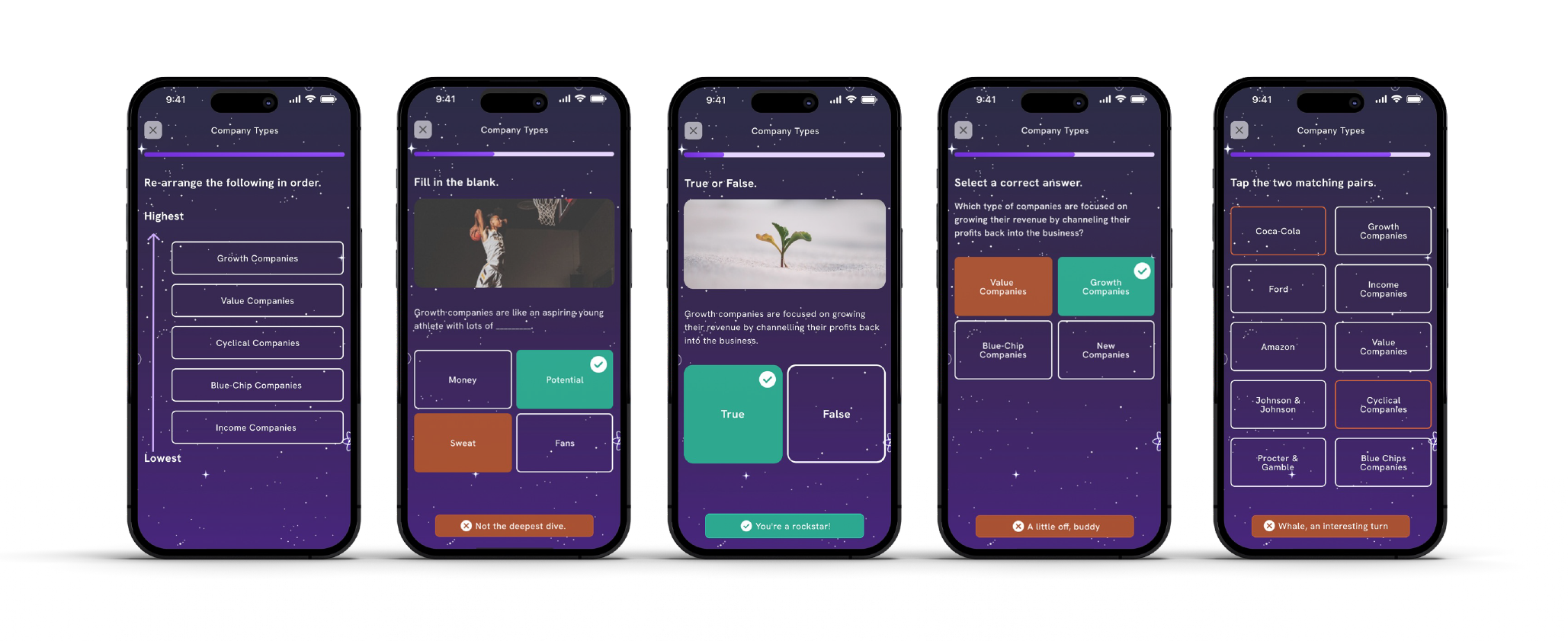
To keep users engaged, quizzes are introduced in five different variations. Haptic notifications with sounds and vibrations are incorporated to stimulate user senses.
Quest — Sharing
Sharing is consistently encouraged throughout the app. All content is made shareable to increase conversation and reach a wider audience.
Profile
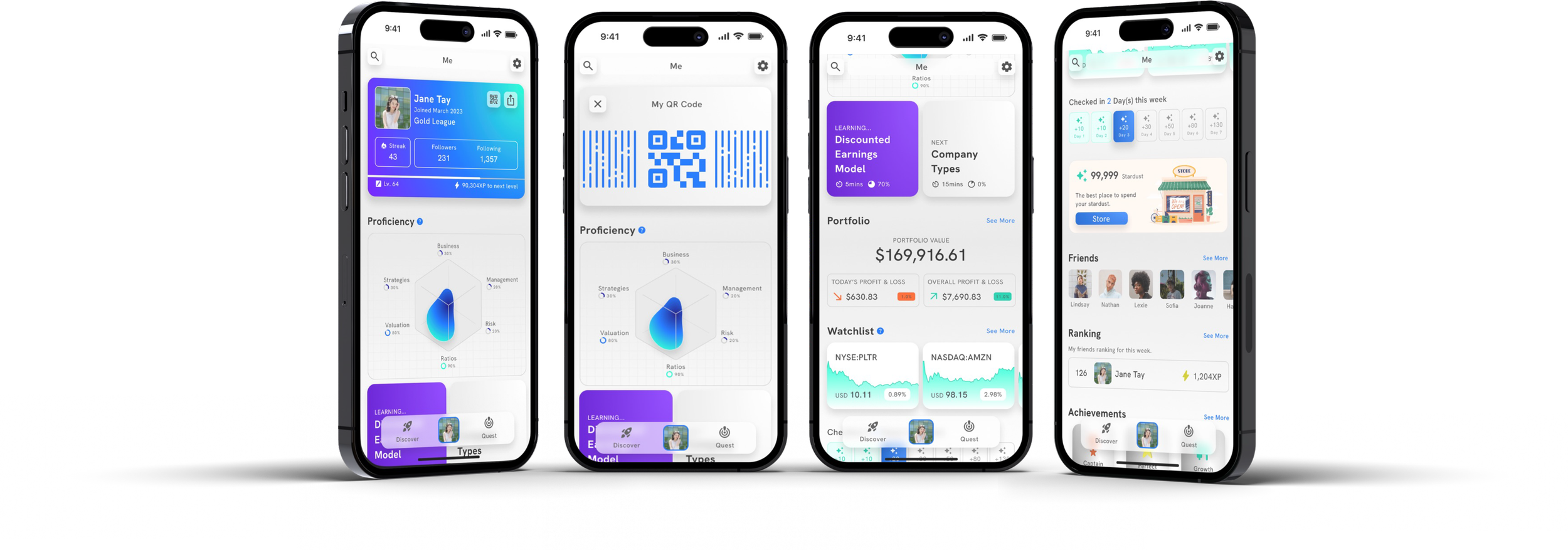
The profile section is personalized and puts users in control of their progress. It provides a comprehensive view of the gamification experience, and the inclusion of QR elements promotes real-life engagement and future possibilities.
Proficiency/Learning
Users can view their proficiency levels to identify areas for improvement and encourage further learning.
Portfolio/Watchlist
Within the profile section, users can access an overview of their portfolio and watchlist, encouraging them to track their investments.
Friends
The social element in the app promotes connection between friends, enhancing user engagement.
Store
As part of the gamification efforts, a store is introduced to incentivize users to return and earn stardust. Stardust can be converted into branded merchandise and collaboration opportunities.
Achievements
Achievements are included as a key gamification element, generating excitement among users.
Ticker
The ticker section provides information in digestible sizes, ensuring users are not overwhelmed. Users are equipped with the knowledge to understand technical terms used across the platform, and the platform’s language is updated accordingly.
Management
The people behind the company are showcased, making it easier to identify familiar faces and encouraging discussion.
New Graphs and Information Breakdown
Graphs and information are presented in a simplified manner, allowing users to review prices and news that impact stock changes. The metrics are broken down into four categories with charts based on growth, profitability, health, and valuation. Users can personalize the page with metrics they have learned from the quest feature.
Metrics
The metrics are designed to be easily understood, and each chart is accompanied by a summary message that reflects the strengths and weaknesses of the stocks. Sharing functionality is emphasized to encourage discussion.
Dive into the Detailed User Interface Case Study Here.
All implementations underwent thorough testing, including maze survey observations, user interviews, and focus groups, before proceeding with development.
In summary, the app has undergone a comprehensive revamp to cater to the needs and interests of potential users. The focus is on providing value and gradually guiding users towards understanding stocks, ultimately converting them into subscribers. The changes are driven by sincere consideration for user needs and feedback gathered during the research process.


