User Interface | Moovaz
Transforming a vendor centric one stop relocation platform to a user centric approach
Timeline: 2.5 months
Project is split into 3 parts: Case Study Research | Building Design System | User Interface Design
User Interface Design
Introduction
Since the start of the internet era in the 2000s, global relocation as a megatrend became more pronounced as connectivity increased and the movement of people from one place in the world to another intensified.
Global Relocation is a huge subject with information scattered. Relocation guidelines between countries are constantly changing especially during the pandemic. With service providers working independently, it was an extremely stressful experience for users to plan their relocation without guidance especially for first timers.
Moovaz started as a tech savvy moving company and transformed over the years to meet the gap by becoming a one-stop platform that allows users to fulfil all their relocation needs within the platform.
Problem
With various research methods used, some major problems were discovered:
1. Over-reliance on human resources
Users for the digital platform have been minimal as users depended heavily on ReloBuddy (Relocation Consultant) to assist them through the processes. Mode of communications were also all over the place.
2. Insufficient information on platform
Users were gathering information from different sources before Moovaz was created. With Moovaz created, other than providing potential vendors that users were able to engage, it was still required to seek information through different sources and to validate those information themselves. That defeats the purpose of being a one stop platform for global relocation.
3. Unable to provide relocation overview
Moovaz provided a planner which users do not know how to use. Based on the insights gathered, users required substantial guidance throughout their relocation process and being able to suggest the next step for their journey helps users gain confidence and feel assured.
4. Insufficient services provided
Services suggested on the platform are not sufficient to meet the needs of users, especially tech savvy digital nomads that travel light and efficiently. There were other services that users required which Moovaz should prioritise.
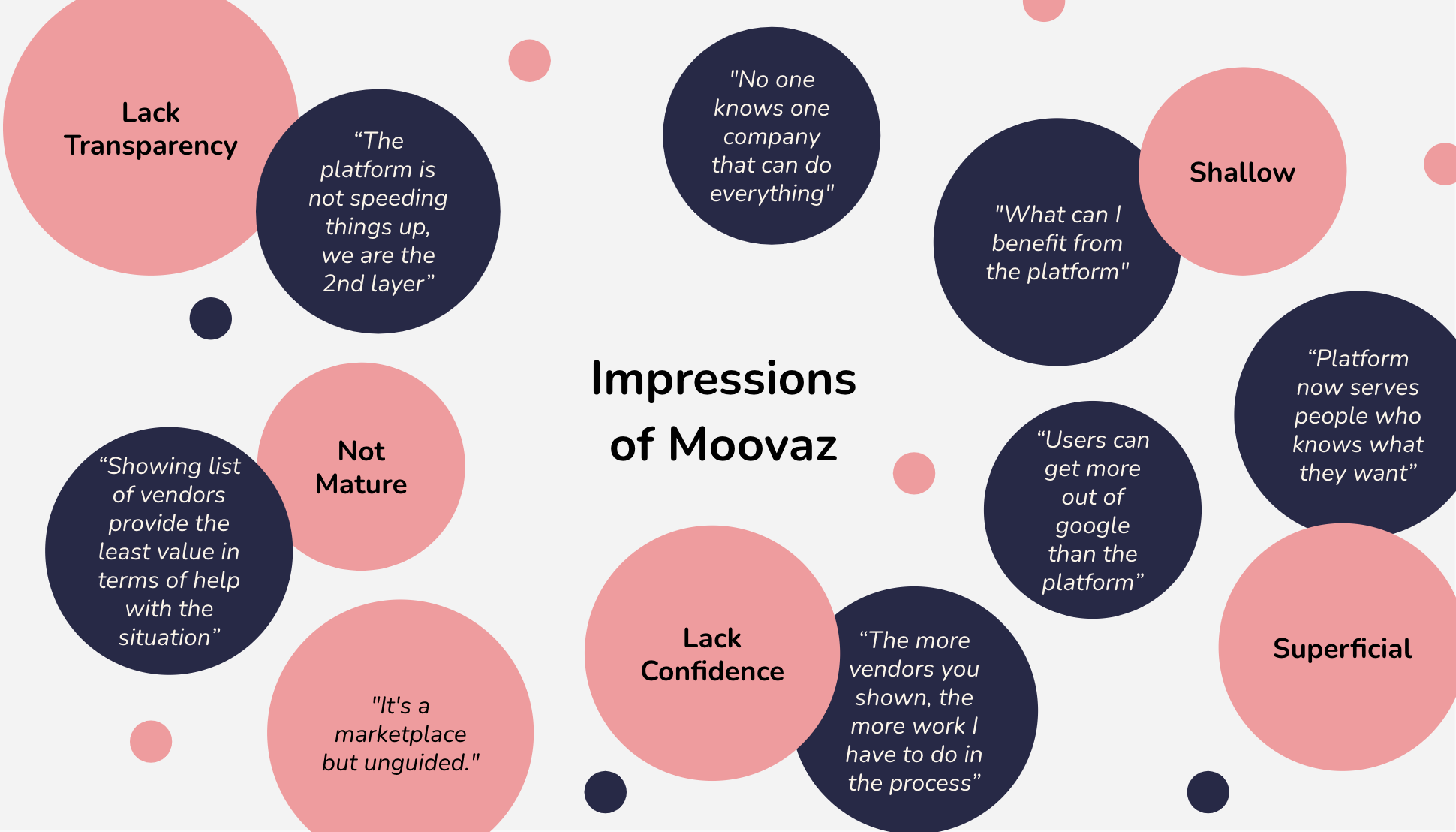
Based on the insights, we also gathered some users' impressions about the brand.
If you would like to find out more regarding the research process, you may read about it here.
The solution was developed through a sprint session with our 2 years goal set out to be
“In 2 Years time, anyone that searches for any relocation related information will go to Moovaz, they will plan their journey, find services and connect with the communities there.”
After identifying the key “HMW” to tackle, we decided to work on the portion of the journey upon sign up till users get a quote on the platform.
HMWs:
• How might we reach the level of knowledge and richness that is superior to local media or Google?
• How might we reach the level of customisation of content and communication with services that users will fully trust?
• How might we create more value than Google search?
Together with the sprint members, we decided to develop the product focusing on the following pillars:
Information
• Curated information about where users may be heading to
• Guidance through every steps of their journey
Community Building
• Allow users to gather unbiased insights from fellow relocators
• Build a reliable community network for all relocators to engage
• Offer an opportunity in the community for fellow relocators to become a relocation buddy
Service Comparison
• Breakdown services provided between service vendors for users to easily compare and understand their differences
• To create a competitive service environment for vendors to maintain a healthy service standard
ReloBuddy
To support users emotionally when they need to speak to someone, as relocation is a stressful process for most people
Solution
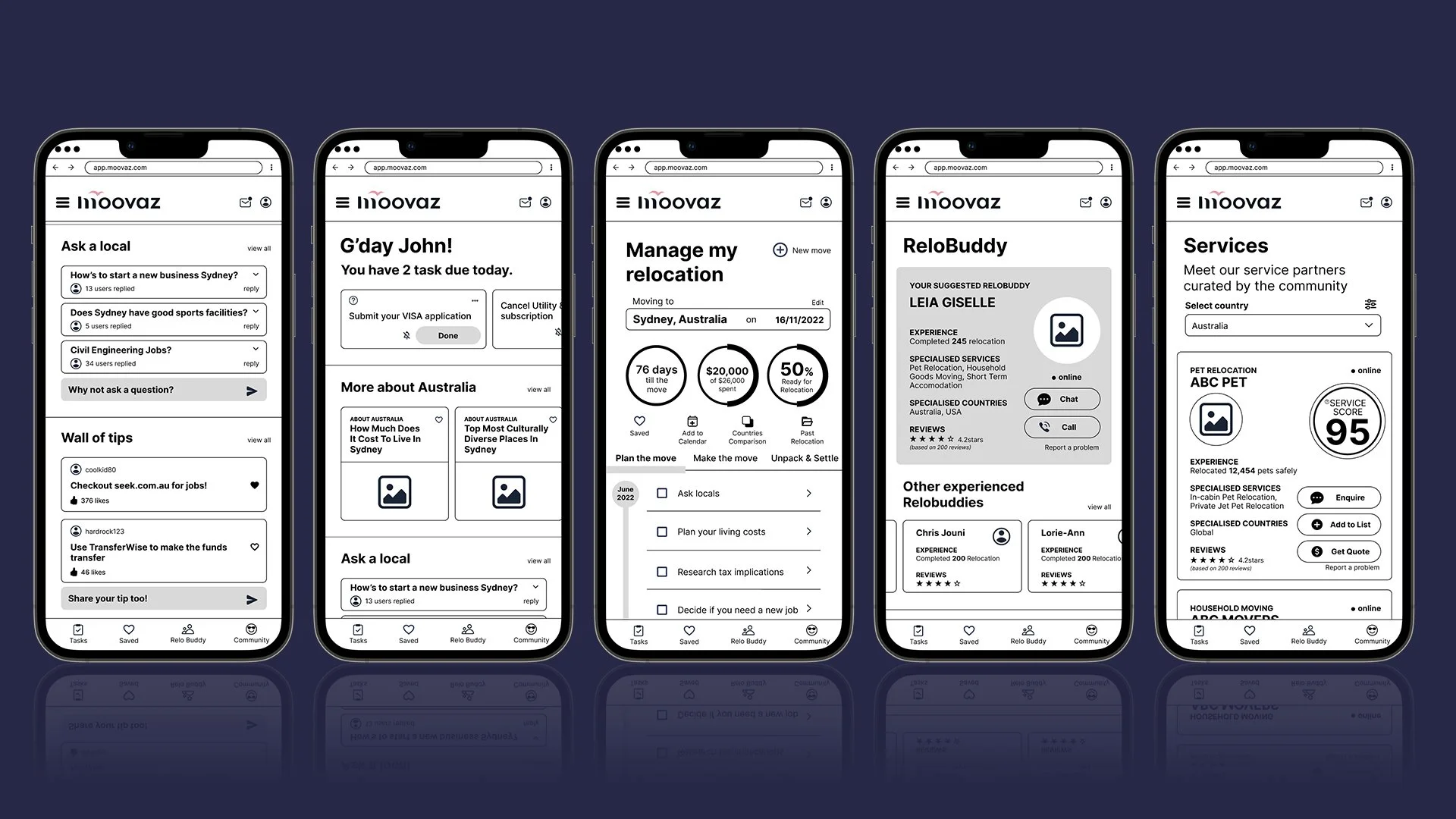
An initial wireframe prototype was done to align within the team and gather some initial feedback before working on a high fidelity prototype.
After developing keyframes in high fidelity, user testing with 5 users were done before we made further adjustments for our prototype and design system.
During the process, the latest design system was used for the prototype for us to adjust and test out usability along the way. Feel free to read up about the design system here.
User Profiling
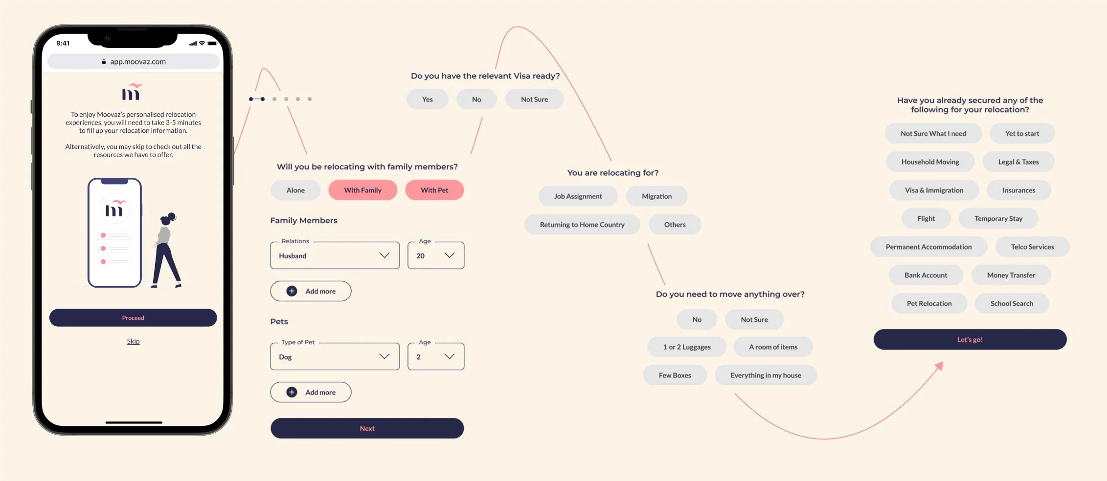
We start the users off from user profiling which will trigger what they see on the platform upon landing. The profiling process can be troublesome for some users, but they are allowed to skip to view what is available on the platform. To simplify the process, we kept most options clickable for users to breeze through the process.
The options will allow us to determine which stage of relocation the users are at, what kind of services they would potentially need, and what kind of information they may be interested in.
Homepage
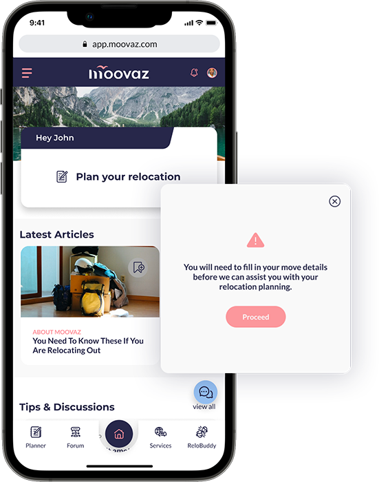
Upon landing, users will see personalised content related to their relocation, articles feed that are relevant based on their stage of move, and community tips and discussions content based on where the users are moving to.
In the event that users skip the user profiling upon sign up, they will be fed with articles that inspire them to relocate or information they may need before they decide to move. On services that require their profiling details, there will be a prompt to lead them to profiling before they can experience it.
Guidance & Planning
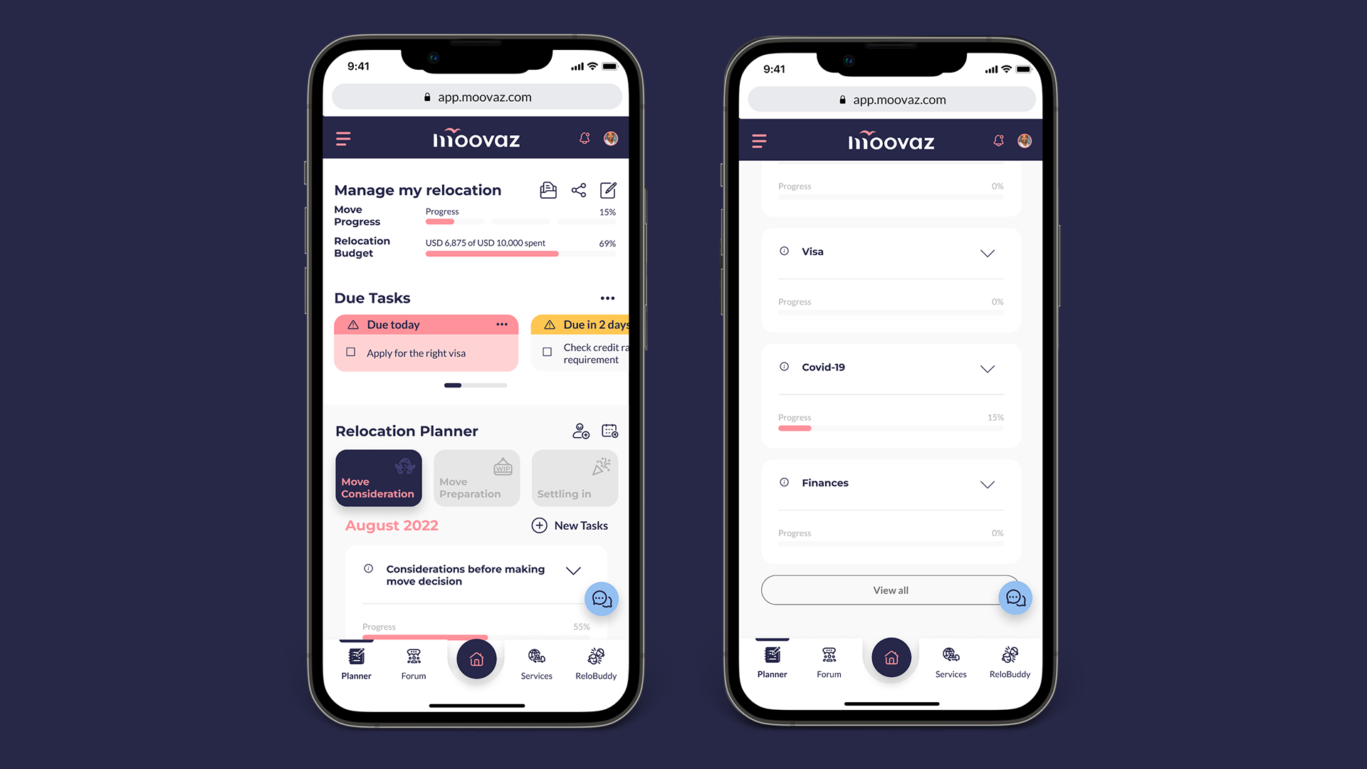
To meet the needs of guidance and planning that users require through their journey, a planner was developed with time triggers to advise users of what to do in sequence of urgency. As there are too many steps and tasks to be fulfilled, tasks were grouped into buckets so it does not overwhelm users.
The planner enables you to share your relocation planning with others. As it may be a family decision that you are making, this will enable all parties to stay updated. You are also able to sync the dates marked on the planner together with your calendar.
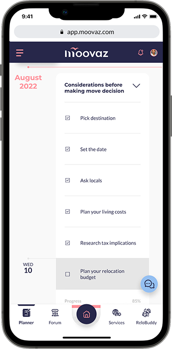
Within each bucket, there will be a breakdown of different tasks that users need to fulfil with the potential completion dates.
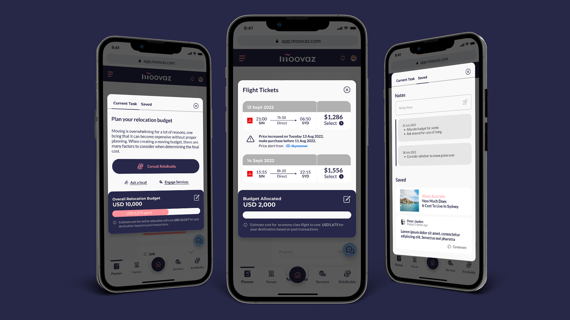
The tasks include a comprehensive series of features:
Able to understand the task that you need to fulfil and why
Seek help or engage services that you may need
Access saved content within the platform related to the bucket of your relocation
Plan your budget with suggested amount generated from past transaction
Stay updated with flight booking promotion
Other supporting features to assist users to manage their relocation:
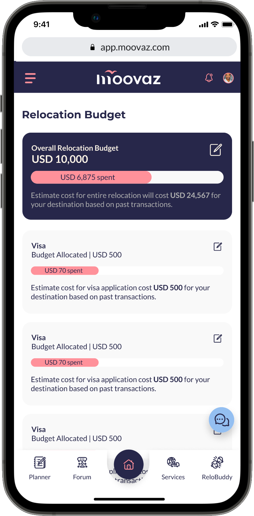
Budget
Allowing users to gain insights about past transactions, monitor and keep track of spending, especially if services are engaged from the platform. This helps to retain users spending within the platform.
Files
Folders are pre-created based on users' needs during the profiling process. With the folders, users can easily share content with vendors and track related documents while travelling.
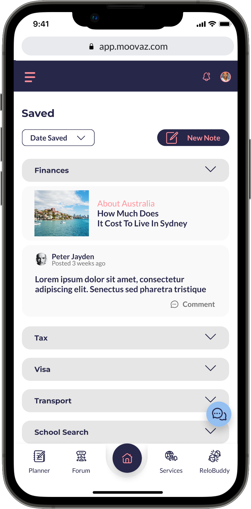
Saved
Act like a bookmark to keep track of all related content or materials within the platform, from discussion to articles. Saving according to the respective buckets created in the planner so users can check back while checking off their planner.
Community Building
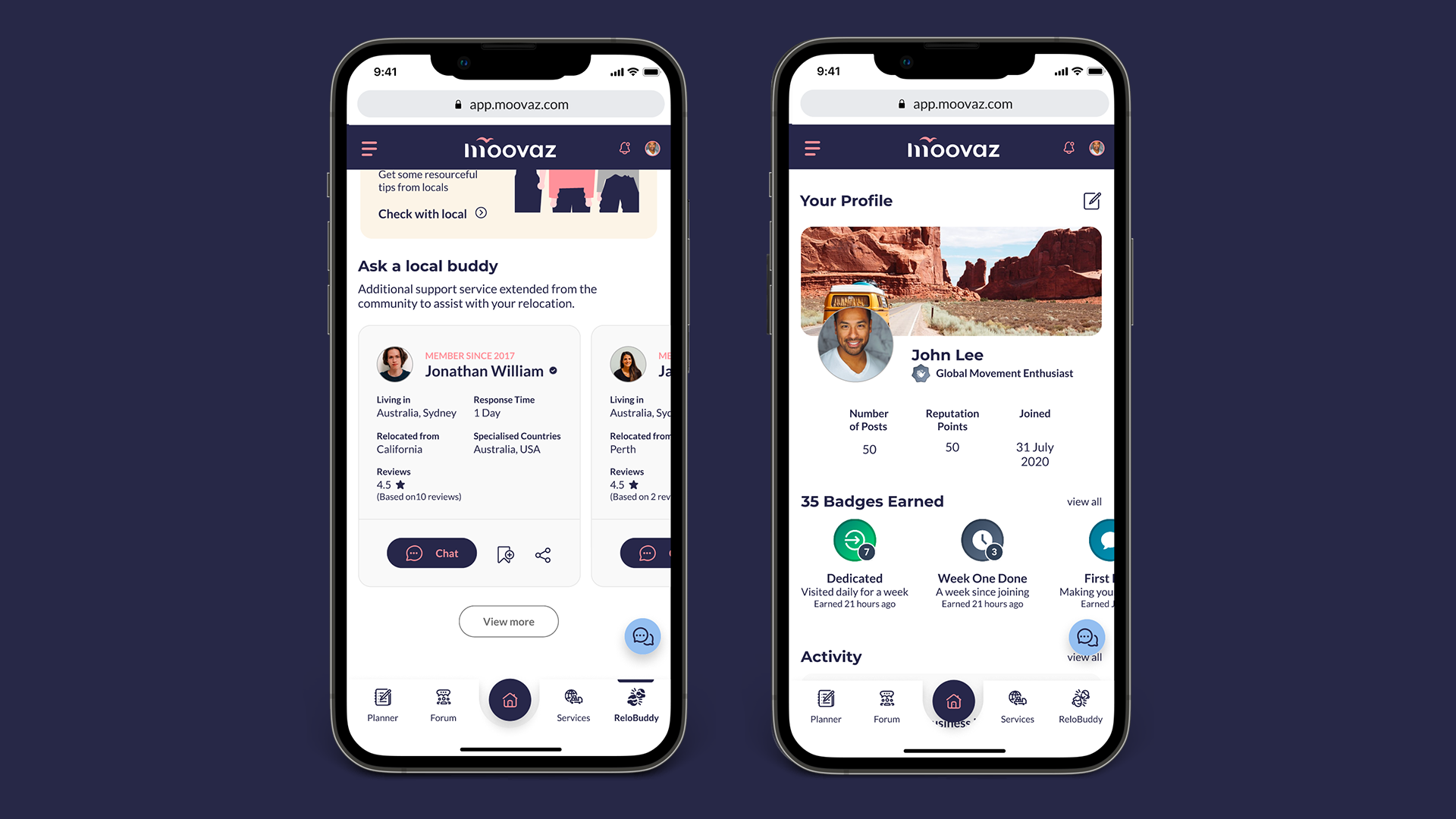
Based on our research insights, users tend to have more confidence and trust towards users with the same experience. With effort to foster a strong relocating community, a forum with a game badge system was included. As the forum was developed as a 3rd party plugin, only related content will be shown while the real interaction will be done within the 3rd party forum.
Despite using a 3rd party forum plugin, efforts were made to generate content within the platform for user profiles and enabling users to engage fellow relocators as their relocation buddy.
Services Comparison
To address the concerns of users feeling overwhelmed with options and not knowing how to make decisions, introduction of vendors were simplified and broken down to similar tabs. This makes it easier for users to understand the differences while making their decisions.
For users that do not understand the purpose of each service,, they are expected to land on the filtered service vertical when the need arises according to the planner timeline.
The filter function was designed to allow users to tap on the choices easily when they check multiple options.
Apart from that, we also standardise the format and information that vendors will have on their profile, making sure only required key information will be reflected.
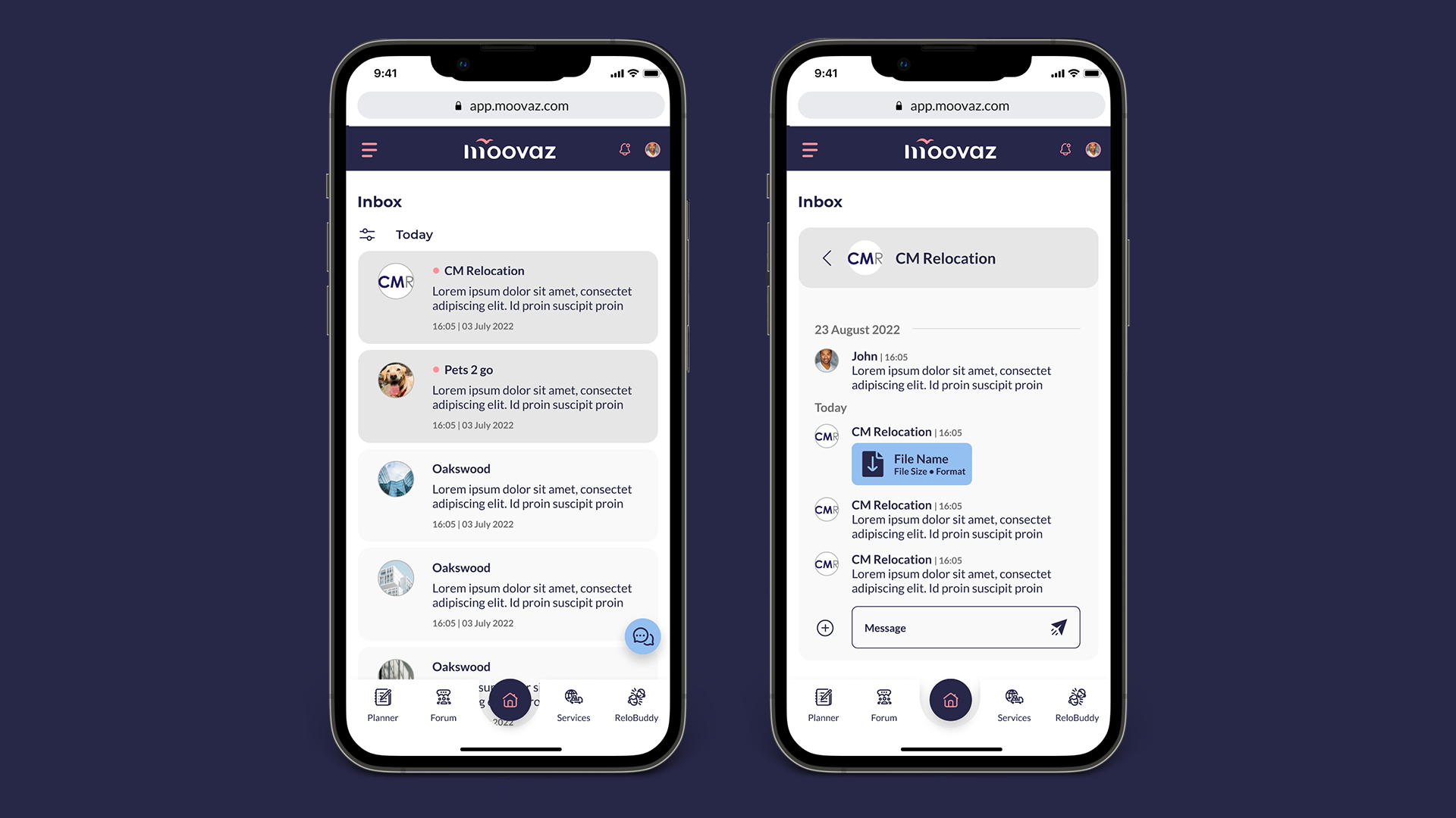
The communication was also improved to include a chat function for users to communicate with vendors before they commit to getting a quote.
ReloBuddy
Last but not least, we included a page for ReloBuddy which is a free service. It acts as emotional support for users throughout their journey. This page was added for users to have a better understanding of what a ReloBuddy does and for them to know more about their appointed ReloBuddy. This feature has helped build trust for the brand as users mentioned that they would still prefer talking to a person they know when planning their relocation.
Conclusion
User interviews were conducted during the process of developing this version of the product, results received were very positive with room for improvement as we continue to improve on the product through more user feedback and data upon launch.
Possible measures for user experiences:
• User duration time within the platform and monitoring where users drop out from the platform
• To lookout for error occurrence rate especially for the planner since it is relatively new, and users will need time to get use to it
• Retention rate to see how often users come back and use the product on a daily basis
The end result is definitely close to what we want to solve as a team for our How-Might-We but this is just the beginning of the product, I believe there is a lot more potential in this product that was built.
Interact with the prototype here.

